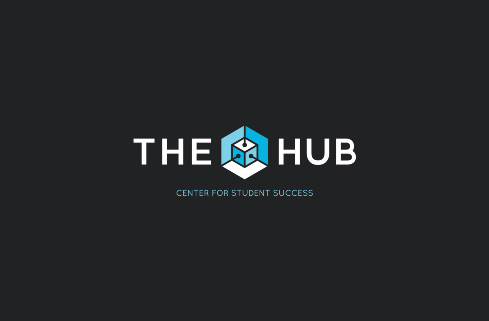
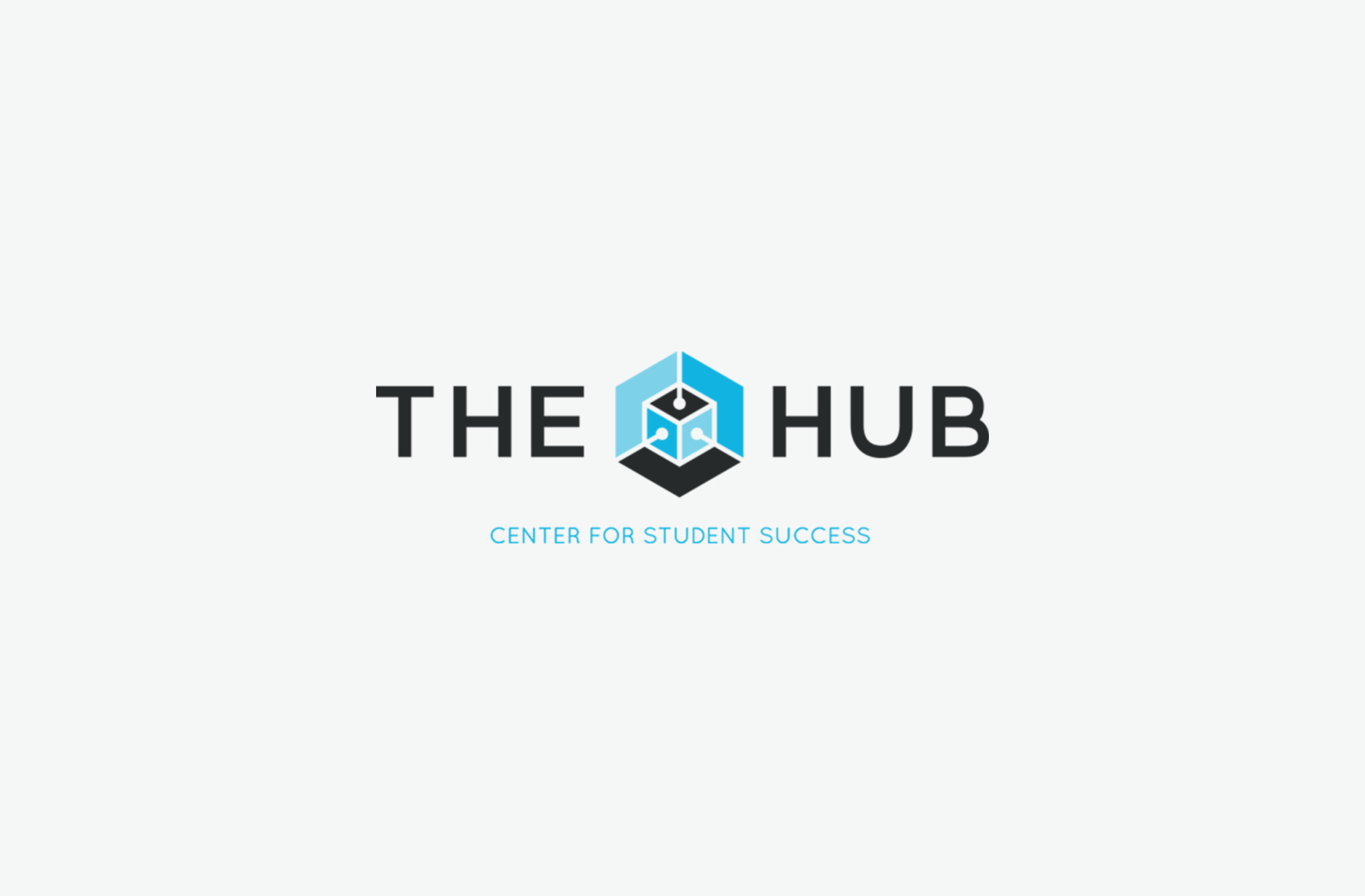
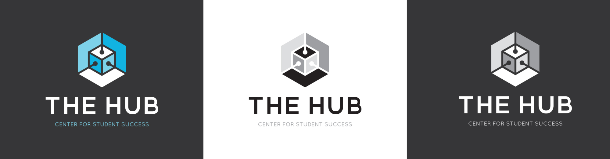
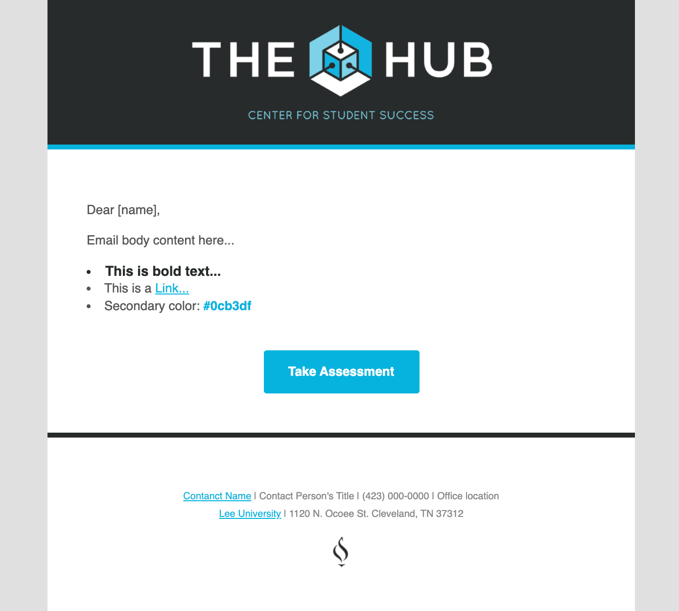
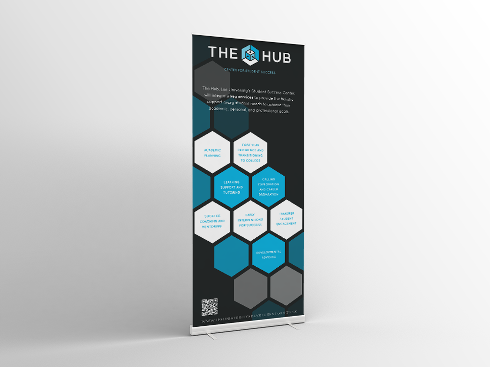
The Hub
The Hub brings everything a student needs to succeed to one place; academic planning, career preparation and exploration, tutoring and much more.
The client wanted their brand to communicate that The Hub is a multiple service "hub" for students. I took the idea of a hub being a place to plugin. The lines that create the sense of a "place" in this logo also create the imagery of inputs to a multiple outlet center. I used blue to convey a since of success, stability, and unity.
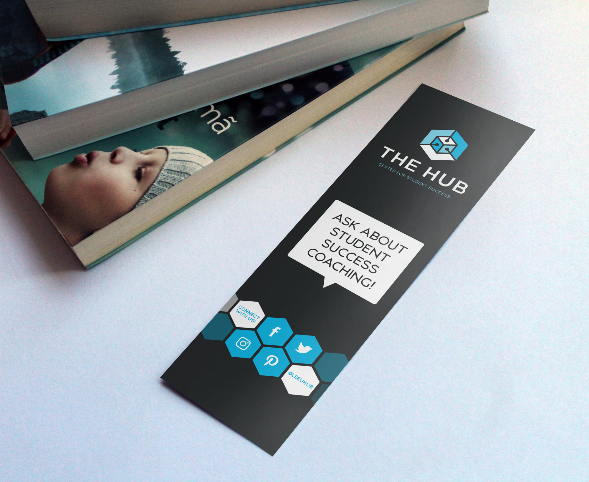
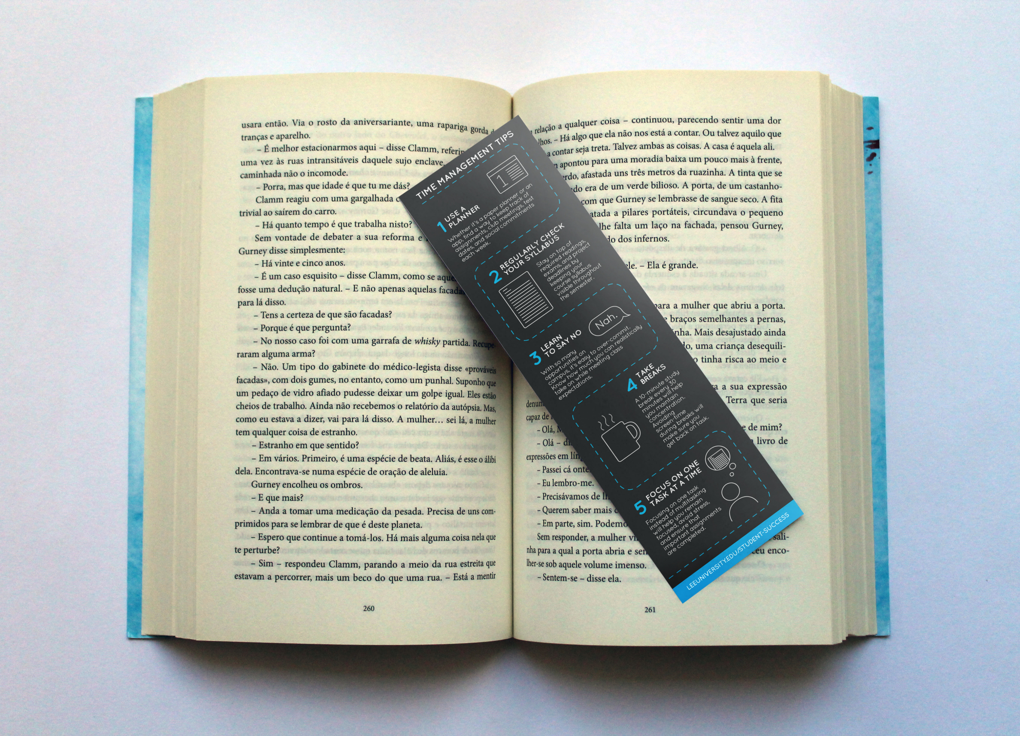
I continued the use of the hexagon beyond the logo by incorporating it in their print material. An example of this can be seen in the bookmark below.